
 To accompany their new site, we created email templates for them so Treza + Karen can keep their customers informed about updates, special offers + anything else they want to share. To streamline the process, we made them a set of templates, each for a different purpose or with a different focus. This way, they can just copy the template that best fits what they want to share and add in the specific information. simple, effortless + visually aligned.
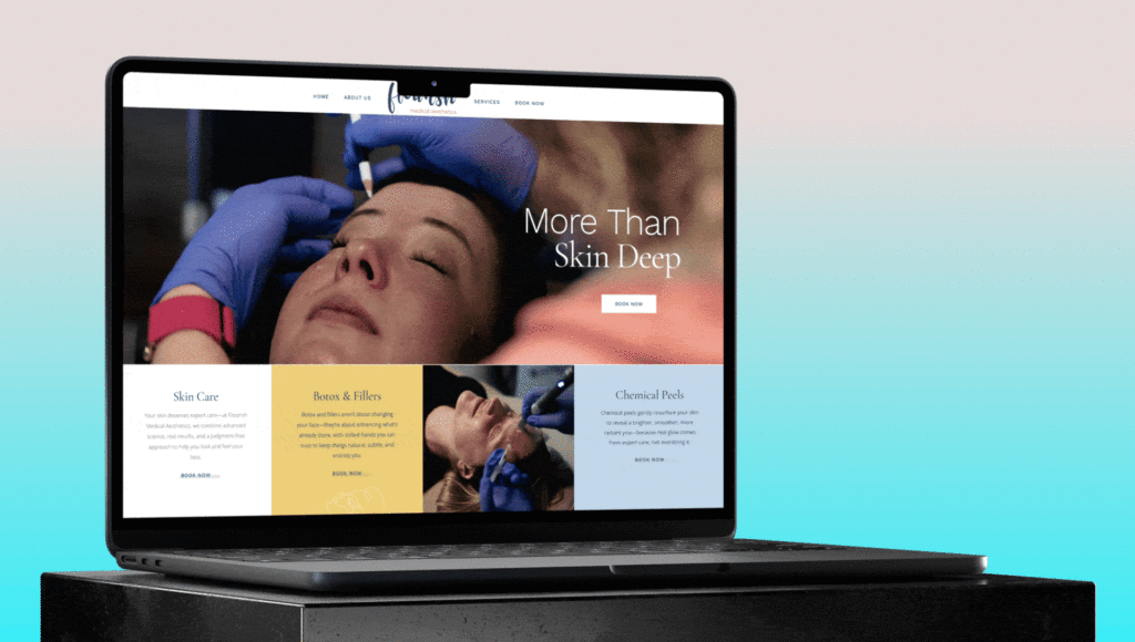
Using the custom photography from our photoshoot with them, the site showcases their services, Treza + Karen themselves, and the brave clients who were willing to let us shove cameras in their faces during their sessions.
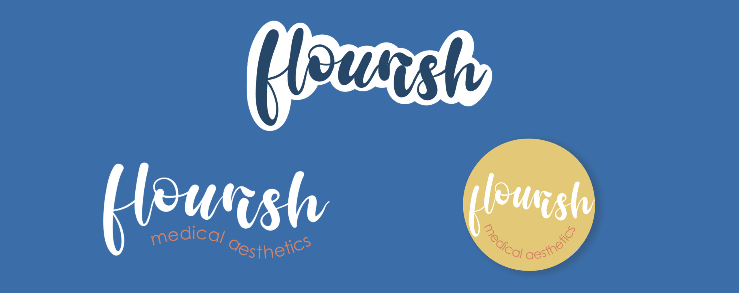
For Flourish, we chose simple, easy-to-read fonts that pair nicely with the more bubbly, flowing text style used in their logo.
Now their logo tells you more about who they are + why they’re doing what they do — because they love it. Because they’re passionate about skincare + helping other people feel good in their skin. Beauty is more than skin deep, but a little self care can go a long way. Their new logo is fun, playful + more uniquely Flourish.