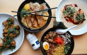
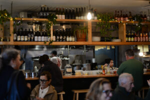
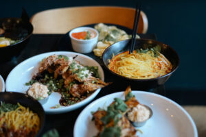
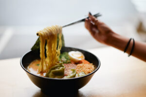
For Anju’s new website, we created an easy-to-navigate template to be used for all three sister companies (including The Dram and The Wilder) and personalized the sites for each individual company. The shared template maintains the connection between all three brands while the customizations show their differences and keep their distinctions clear. We kept the new websites in their existing content management system for the sake of easy use on the owner’s part. We decided to use playful colors and fonts for Anju to emphasize their laid-back, casual environment.
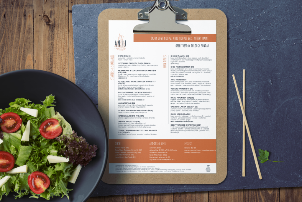
Anju’s menu needed a redesign to make it clearer, more concise, and easier for customers to navigate. We used their existing menu as a template and rearranged the content to create better focus throughout each section and meal course. We also added pops of colors to draw the customer’s eye to certain items and emphasize the menu’s sections, making it easier to read. This way customers can spend less time scouring the menu and more time connecting with each other in Anju’s lively setting!


