Is it possible to be both badass and cute? You betcha.
Pandocs.io is a company made for developers by developers. The platform itself was created so that docs could be reimagined as Dev Infra and so that developers have a well-structured place to create and share their docs.
Over last holiday season, pandocs approached reCreative looking for a cute but fierce logo + brand guidelines to help drive brand recognition and position them as a business that VC’s would take a chance on.
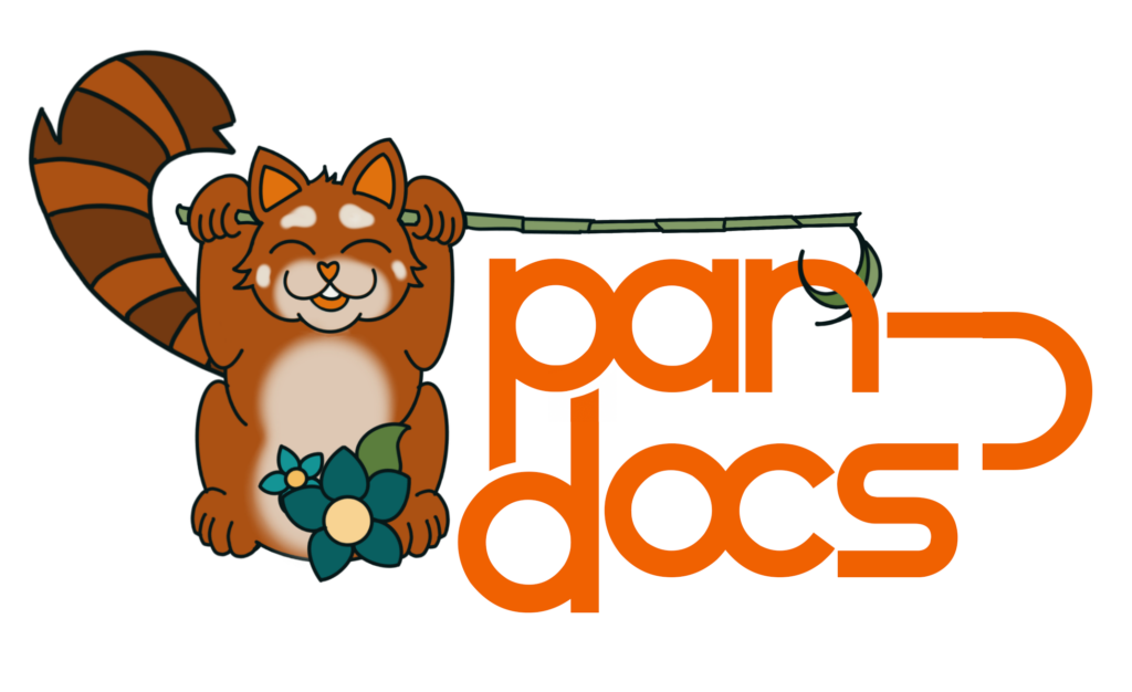
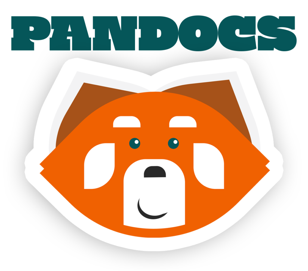
The project began with research, tone, and three distinct logo options:
1. Hand-drawn, heavy emphasis on cute
2. Badass red panda icon
3. More textual than graphic, still adorable
Ultimately pandocs chose [2] the badass red panda.