reflective designworks
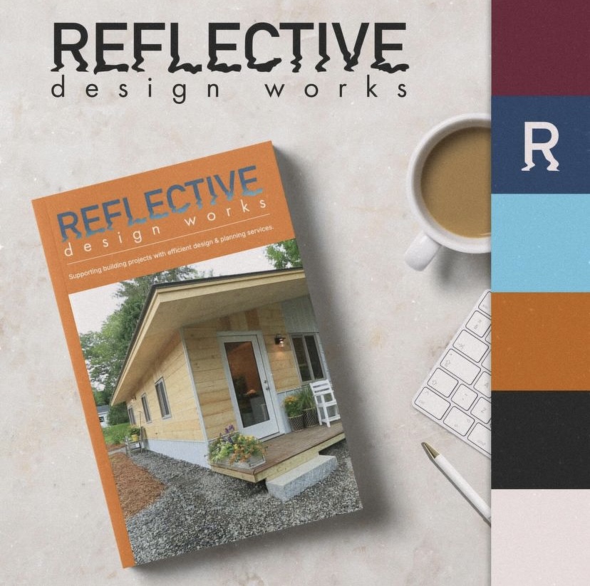
Chris from Reflective Designworks approached looking for some help vectorizing his logo and *possibly* refreshing it a bit. The vectorizing, we could do no problem, but the potential for a logo redesign had our creative curiosity peaked.
RDW’s old logo leaned more towards classic and simple, while we like to add a little extra flair and lightning. We saw a lot of potential in this logo; it had good bones, as they say. We added a funky wavy effect to the word “reflective” and came up with a new color palette that we thought *reflected* the company’s spirit.
Chris said, ”looking at the logos you came up with was like seeing a twin you never knew you had or something – there I am!, wait is it someone else? Lol. Very cool idea with the wavy/watery bottoms of the letters!”
Our design was born from his vision, but pushed it that extra bit further to the edge to make it stand out and hit hard. We kept his main font, as requested, but added elements that brought it to life.

We had lots of fun working on this project with Chris and hope to work with him again in the future!


