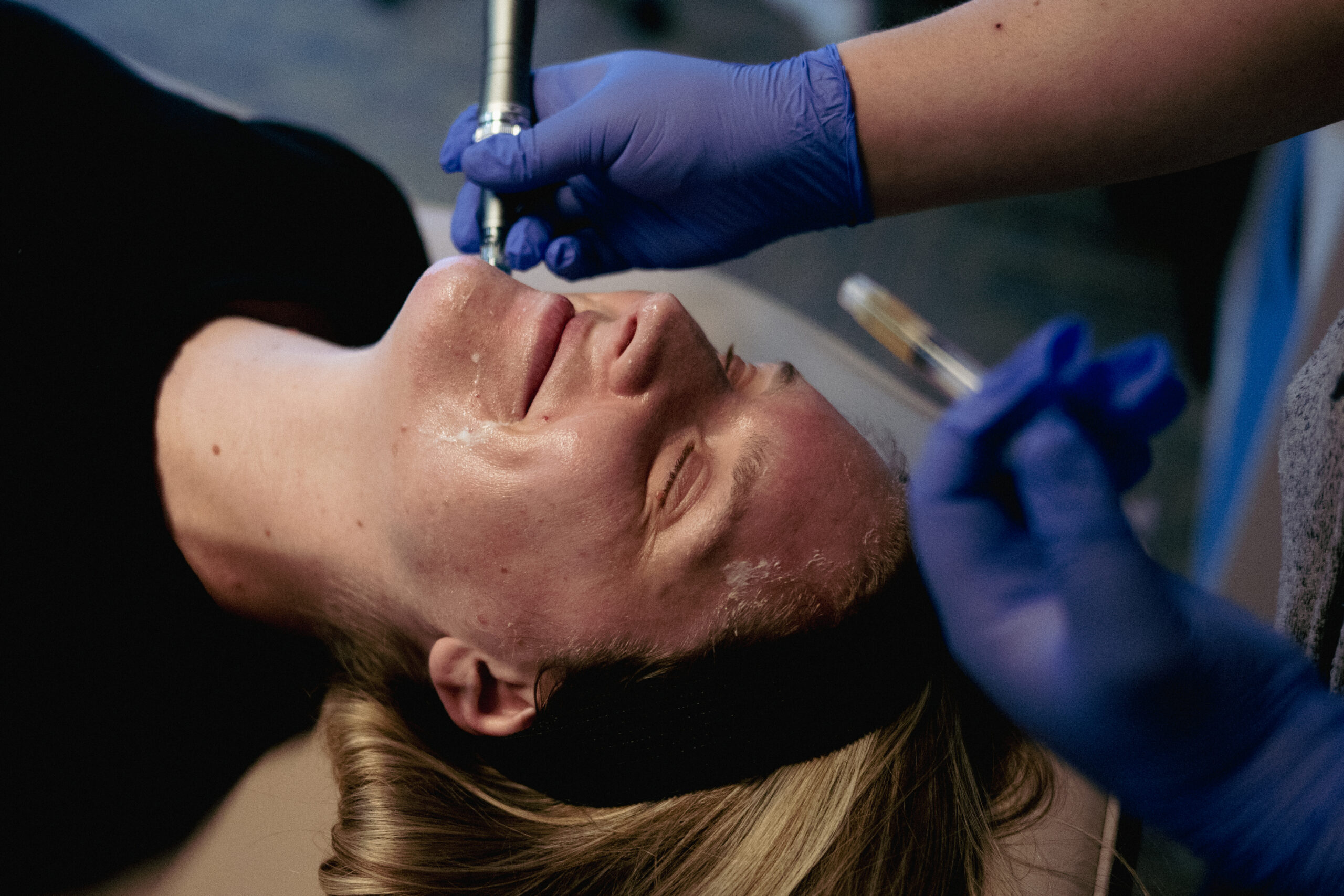
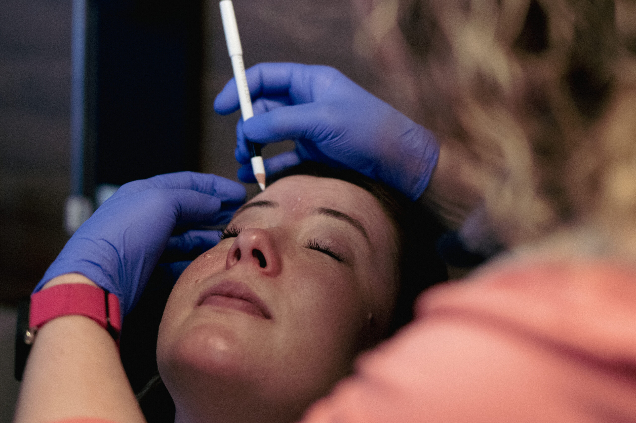
Treza of Flourish initially approached us seeking brand photography for her spa after seeing pictures from our shoot at Niki’s head spa in Moodra hair salon. Following Treza’s photoshoot, she reached back out to us at reCreative to discuss a larger project.
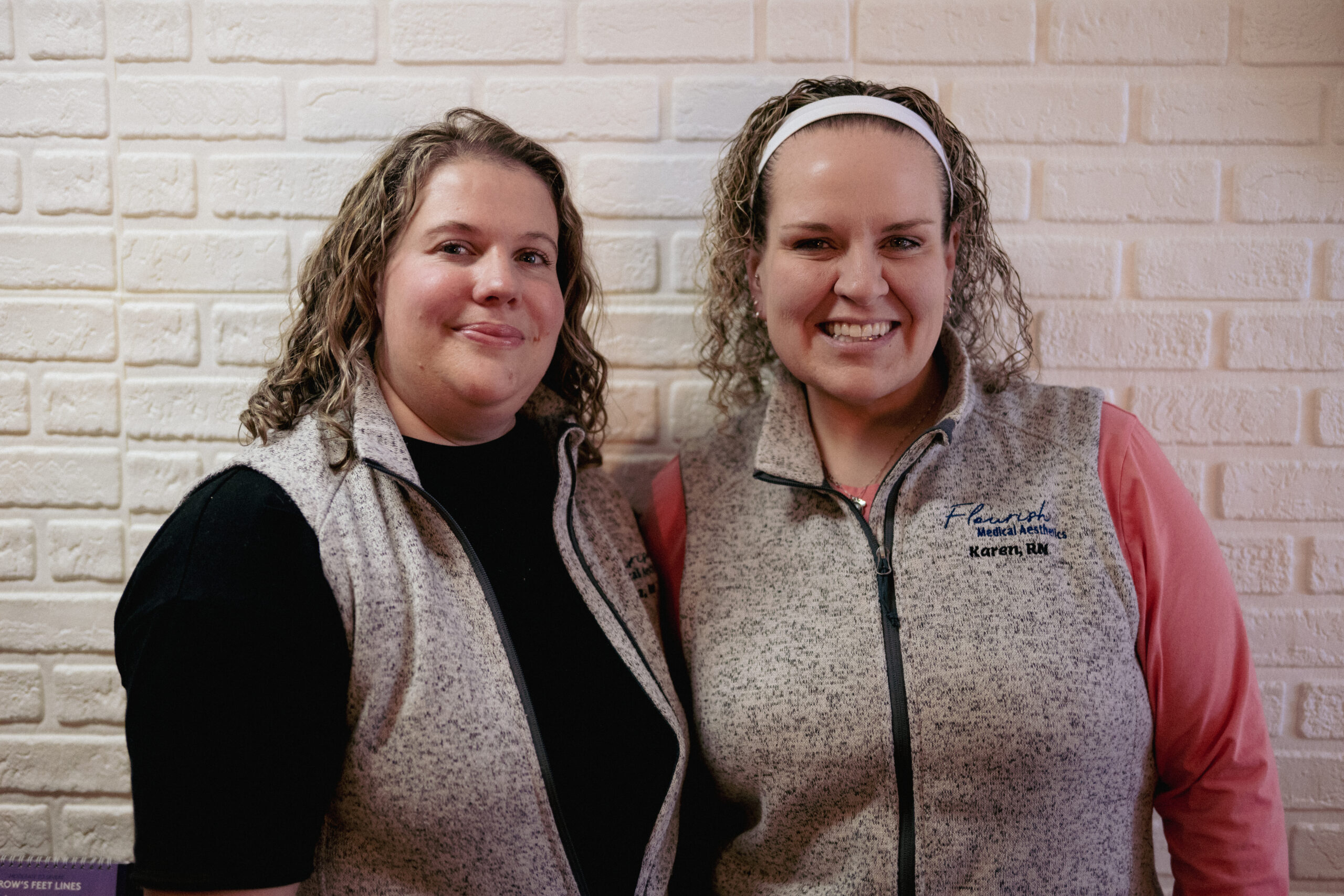
Flourish’s old logo was exactly what you think a spa logo would look like: a generic, floral line drawing with equally plain italic text. It was doing nothing to help them stand out from competing spas. Treza wanted her branding to feel more playful, fun, and airy. She wanted customers to feel welcomed and for her and her partner Karen’s personalities to shine through.
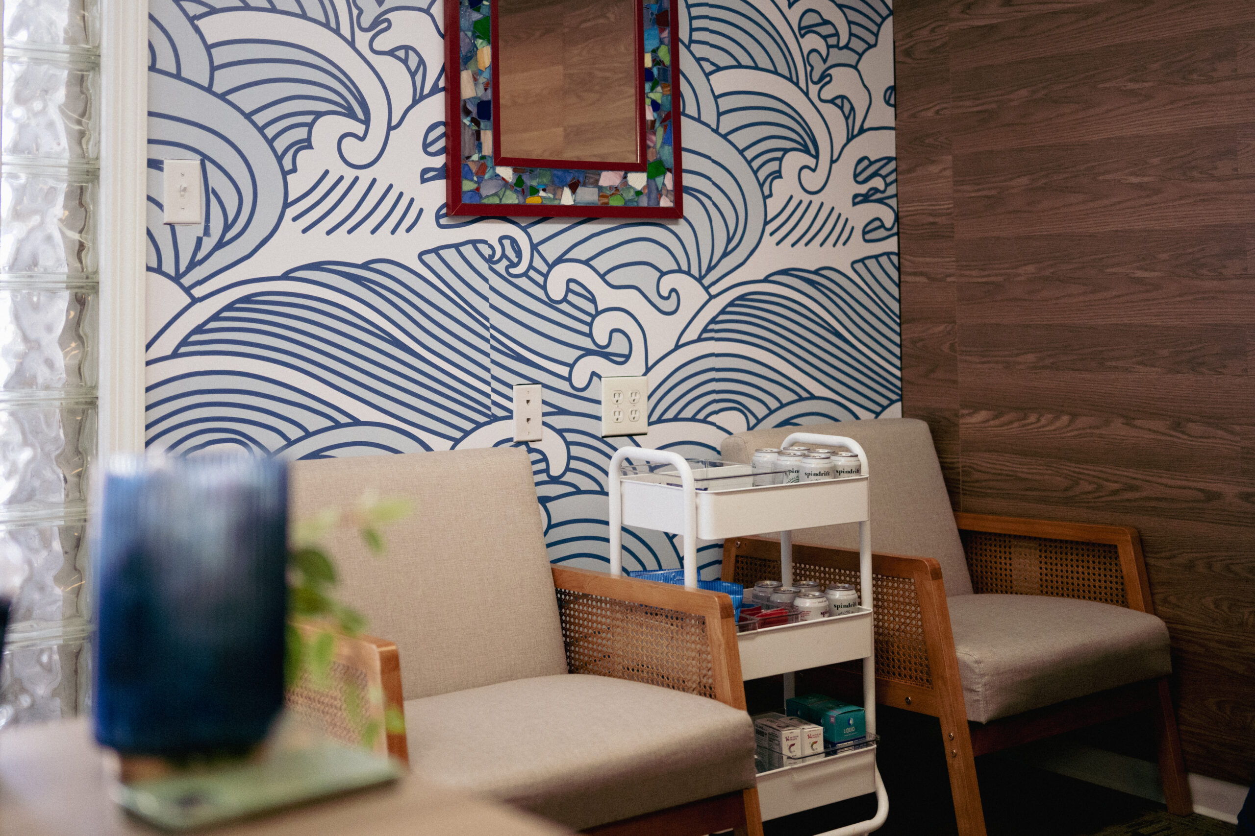
We replaced Flourish’s basic, dull logo, branding, and color palette with something much more *them.* With bubbly letters and brighter colors, Flourish’s new logo has way more personality. Their new site brings the branding together and helps Treza tell customers the story of how Flourish began.