
The Impact of Color Psychology in Advertising
For visual media, color is one of the main factors to consider when starting out. One of the first things we do when we’re starting a new web design project is choose a color palette. While some people might think this process is only about picking which colors look good, there’s often a deeper reasoning behind which colors get chosen for which brand and why.
Color psychology is a huge part of design because we as humans largely love color. Certain colors convey certain messages and evoke different feelings in people. These color inclinations can be used by brands and businesses to send consumers a message about their product or service and influence purchase decisions.
Sometimes the feelings various colors can trigger in people aren’t immediately clear or even conscious, but they can seriously impact how people perceive brands and how compelled they feel to buy a product. Regardless of how subconscious these mechanisms are, a whole lot of research has been done to determine which colors are best for brands and businesses based on what they’re trying to sell and to whom.
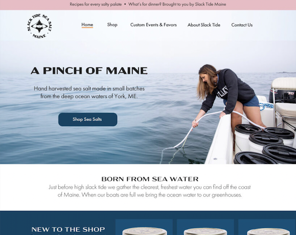
We recently designed a new website for Slack Tide Maine, a local York business that hand-harvests and sells flake sea salt from the ocean off the coast of Maine. Slack Tide is owned by three lovely women and also sells a range of products besides their delicious sea salt like clothing, gifts, and home goods.
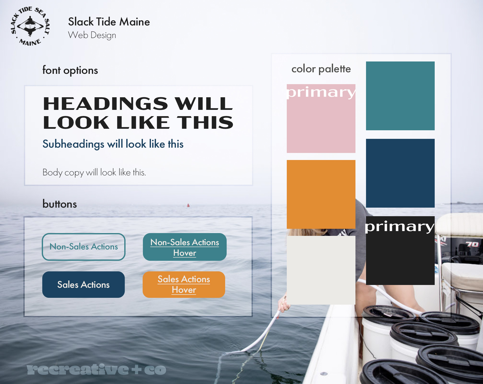
They had an existing color palette of pink and blue which we all agreed should remain. However, they were using pretty bright shades which reminded us of a certain coastal clothing brand, so we wanted to switch up the shades a little to weaken that mental connection. See, color psychology is strong enough that just from “bright pink and blue clothing company,” you likely know who we meant.
We wanted to keep the pink for a couple of reasons. Firstly, pink is generally associated with more feminine ideas, and therefore used to market to women and young girls far more often than to men and boys. While sea salt is for everyone, a much larger percentage of Slack Tide’s customer base is women compared to men. On top of marketing reasons, we wanted to keep the pink to emphasize that this is a proudly women-owned company. However, we did end up bringing the brightness down a notch on the pink to add some sophistication.
On the flip side, blue is a color that often appeals to both men and women. Blue tends to carry a note of trustworthiness and security. This is obviously something every business wants to convey to their customers, but Slack Tide had an extra reason to keep the blue in the picture.
Blue also conveys feelings of tranquility and calm because of its association with the ocean. With Slack Tide being a coastal company that revolves around the ocean, blue is the perfect color to represent their focus on the sea. The blue in Slack Tide’s site helps set the scene of being out on the water in a boat off the coast with the sun shining down on you, blue skies all around.
We also ended up adding a cool shade of orange as an accent color for pages and buttons that focus on sales. Orange is a creative, enthusiastic color that tends to work well with calls to action and sales opportunities because of its boldness.
Overall, we think we found the perfect palette for Slack Tide.
Even just a change in the color of a single button can impact conversion rates. Color is a powerful element in advertising that can seriously and directly impact your business’s performance. Considering the implications of color psychology in advertising can help you better guide your strategy to market more effectively to your target audience.
Learning about which feelings different colors trigger can help you choose colors that align with and project your company’s values and goals. Making sure that the colors in your logo and website deliver customers the message you want to convey can improve your advertising in a big way.