Have you ever stopped to think about how your eye is drawn to certain things on a poster or advertisement? Have you thought about how the text guides you through the information? Have you considered the role of the text at all past being how the message of the media is communicated?
If you haven’t thought about it all that much, you’re not the only one. Typography, the arrangement of text in terms of font, size, color, and spacing, exists in almost all media. Ads, magazines, websites, signs, and everything else with text have to be designed with typography in mind.
Typography absolutely cannot be overlooked in any design. Graphic design students are often taught this lesson very early on. Fonts and styles can convey different messages, even if the same words are on the page. They each have their own “personality” and visual voice that impact how the message is perceived. By using different fonts, designers can convey messages with more meaning than what is explicitly stated in the text.
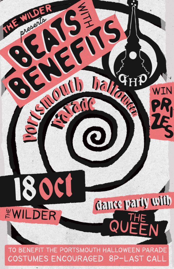
When we were tasked with designing poster for The Wilder’s Halloween event last year, we knew the typography had to convey the fun, spooky nature of the event. We used a bubbly, fun, hand-drawn font for the name of the event and made it the largest piece of text on the poster. We then scattered the other important information around the poster in similar but less in-your-face typography.
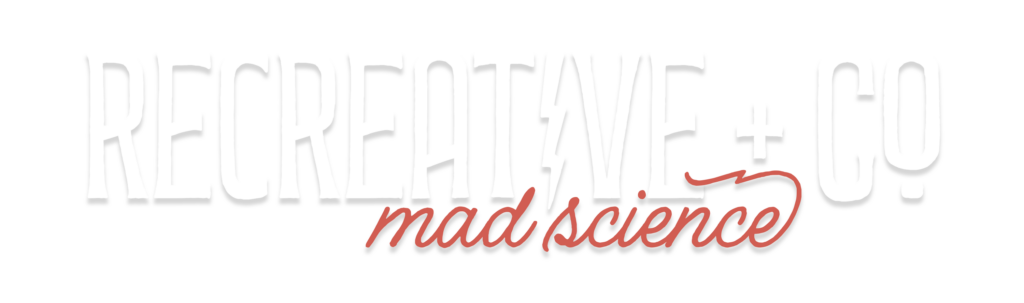
Typography even plays a huge role in branding. Consistent typography is crucial to building brand recognition. One of the reasons we can spot a particular product so easily is the typography they use in their logo and branding materials.
Knowing your audience and crafting a typography that appeals to them is super important when creating a design.
Typography plays a huge role in conveying your message effectively, and you absolutely cannot just slap any font on a poster and call it a day. It’s important to learn about the messages different typographies send to your readers before they even begin reading.