The Art of Packaging Design: Capturing Consumer Attention in an Oversaturated Market
Everyone has heard the old adage: “don’t judge a book by its cover,” but in an ever-increasingly oversaturated market, judging products on face value and making purchases based on visual appeal is more and more common.
Let’s be honest with ourselves. We’ve all bought something purely because we thought it looked cool at least once in our lives. Maybe it turned out well and was actually a great purchase! Or maybe it sat on a shelf in your house collecting dust until one day it caught your eye and you wondered What even is that? Why did I buy this? before throwing it out.
Regardless, this phenomenon proves that packaging does indeed matter. Quite a lot in some cases.
If we set the scene a little and put you, someone who knows only a little-to-normal amount about beer, in a beer shop and ask you to pick out a beer, how are you going to narrow down your choices?
Well, one way is certainly if you know you prefer a certain style. That still leaves you with plenty of choices though. Maybe now you’ll start to read the names – of both the breweries and the specific beers. However, I think we all know our immediate instinct is going to lean towards what looks the best.
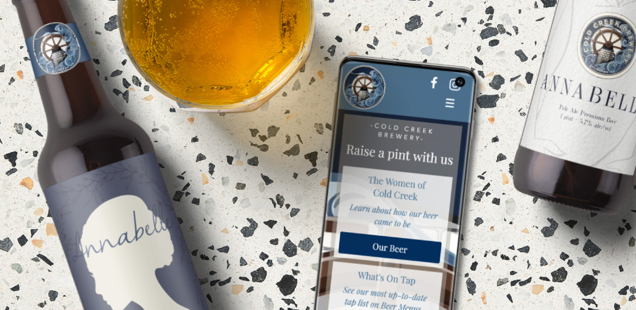
A while back, when reCreative was just starting out, we worked with Cold Creek Brewery to create labels for their crowler cans, hoping to help them stand out from the crowd.
We wanted to create something more simple, light, and elegant to stand out from all the dark, intense cans that were on the market at the time.
Cold Creek wanted a single label that they could use for each of their individual, woman-named, brews. We stepped up to the task by creating six different options before finally landing on a cameo-inspired label that would vary based on the amount of hoppiness within each beer.
Afterward, we went on to win packaging design for our hoppy labels at the Connecticut Ad Club Awards. Our simple, classy design helped CCB stand out from the crowd and made their beers feel more unique than other cans.
Knowing your audience can be a huge part of creating a successful packaging design. You want your design to stand out, but you also want it to attract and appeal to your target audience. We were happy to help Cold Creek Brewery create a label design that could catch the attention of their ideal customers, leading to actual sales and new loyal customers!
If you’re looking for help creating a package design that both you and your ideal customers will love, give us a shout! We’d love to help you design the perfect label for your product.


