Typography Trends for Holiday Campaigns: Fonts That Feel Festive
Planning a spooky Halloween event or a festive Día de Los Muertos party? Struggling to find a way to make your graphics *feel* like the occasion? Try experimenting with these design elements to bring the right vibe to your design.
The obvious first step to making your poster feel festive is to add details and hand-drawn elements that emulate the holiday. For Halloween, add a jack-o-lantern or skull; for Thanksgiving, a turkey or cornucopia; for Christmas, a decorated tree and Santa. These will definitely put your design in the right mood.
You can also use colors that are on theme. Many holidays have specific associations with colors or shades. Easter owns pastels, while Valentine’s Day deals in pinks and reds. Adding the appropriate colors to your design won’t just make it feel more on theme, but the lack of those colors may even be confusing or jarring to the viewer.
Both of the previous elements are pretty basic, but what about fonts and typography? Have you played it safe with your normal fonts, or have you shaken things up by implementing fun, festive fonts? While at times overlooked, fonts play a huge role in how your audience receives the message you’re sending them. Although less bold and obvious than a purple bat and an orange jack-o-lantern, a spooky font can also add to the Halloween spirit.
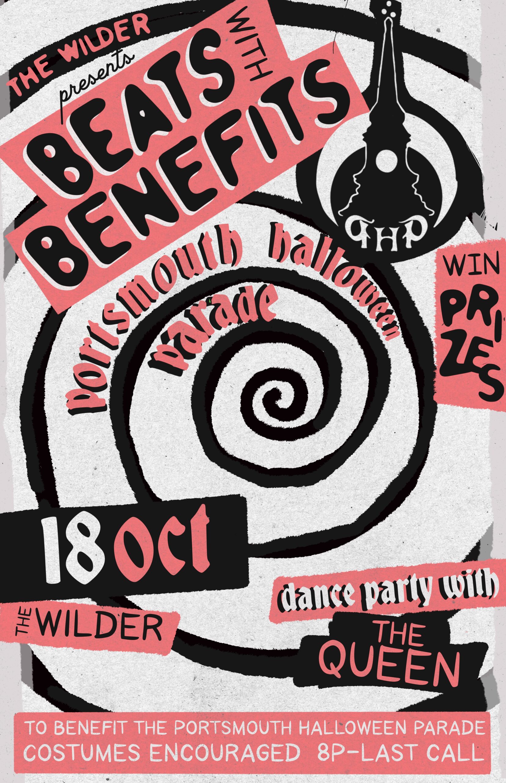
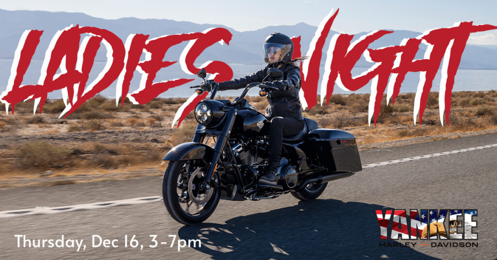
In designing Halloween event posters for The Wilder and edgy events for Yankee Harley-Davidson, we utilized spooky fonts to really set the tone of the event. With all the elements coming together, these posters feel like Halloween instead of just stating they’re about Halloween.
There are plenty of websites out there that can help you find the perfect font for your event with search features that sort fonts by the holiday or occasion they’re best suited for. Think Tim Burton title screens. Those are the styles of fonts you’ll get when you search for Halloween. Right on the money!

The slash-like font of “Ladies Night” on the Yankee banner looks like scratches from a monster. Doesn’t that design just make you think of a slasher? It hits “badass biker girl” right on the head.
The angular fonts with drop-shadows used throughout the poster for The Wilder convey a sense of something creeping around behind you…
Fonts can be super significant in conveying any feeling: warmth around Christmas, fear and unease around Halloween, gratitude and reminders of family around Thanksgiving, and love for Valentine’s; the possibilities are endless. If your design just isn’t coming together how you’d like and you’re unsure how to fix it, consider playing around with some fun, out-of-the-ordinary fonts. It may be just the thing you need to pull the whole thing together and make it hit its mark with impact.


