
Doodles to Brand: The Real Process of Building a Brand Identity System
Every brand starts somewhere. The illustrators and graphic designers behind most iconic brands will tell you that more often than not, that start is a quick doodle jotted down amidst conversations about concepts or on the way out the door when inspiration strikes randomly. It’s what comes next, turning those sketches into a fully developed brand identity, that brings an idea to life.
Building a brand isn’t just about making everything look pretty. It’s about crafting a personality, vibe, and unique voice that resonates with people. Here’s how we created the branding materials for Seacoast Racing – from sketches based on the name alone to the final design.
Seacoast Racing is a new local cycling team who connected with Meg through the cycling community and asked about a brand identity design. Meg is an avid cyclist, riding almost every day, and jumped at the chance to help out some fellow cyclists. reCreative has since become sponsors of Seacoast Racing’s inaugural season, and Meg hopes to join the women’s team when the time comes.
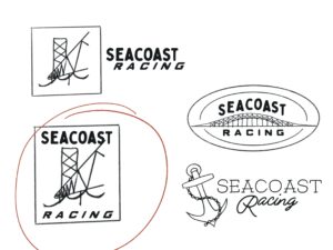 For the design, Meg wanted the imagery to be firmly rooted in the seacoast, just like the team’s name. She drew up a few sketches around different nautical, seacoast themes, and landed on one featuring waves and the iconic Portsmouth Memorial bridge.
Meg’s creative tool of choice when creating brand designs is her trusty iPad and Apple pencil. She uses her iPad as the digital hub for the creative studio, using it for tasks like notetaking as well as for illustration and design. From the hand-drawn design to the placement of the text, the iPad is the best creative tool for the job, IMHO (in Meg’s humble opinion).
The color palette was partially influenced by the colors on the racing suit. While we created a color palette we’re quite fond of, it didn’t match well with the bright pink and blue colors on the race suit, so we had to adjust them. Now, the branding colors match the colors on the suit, and all together it looks like a cohesive unit.
It took a while for us to get from initial doodles to the final design. That’s where all the real work lives, in the in between. The back and forth with the client, tweaking things until it looks just right and feels like one solid, coherent brand identity.