2024 Graphic Design Trends We Can Get Behind
As a business whose bread and butter is creative digital design, we know how important it is to keep an eye out for upcoming trends in the industry. Although we’re confident in our distinct style, we know that sometimes adding in some trendy elements can be important in a successful design.
Designers can use trends to keep their work feeling current and make sure their designs are optimized for the newest platforms and technologies that are changing every day. One of the main projects we’ve been working on is the posters and social media counterparts we’ve done for The Wilder when they’ve hosted various cool events.
We used some rising trendy elements like 3D lettering, illustration, bold colors, and minimalism in our pieces for them. Hand-drawn illustrations might be our favorite, and we’re glad it’s getting its time in the spotlight, especially with AI art on the rise. We think it’s important to customize as much as possible whenever we’re making anything new for a client.
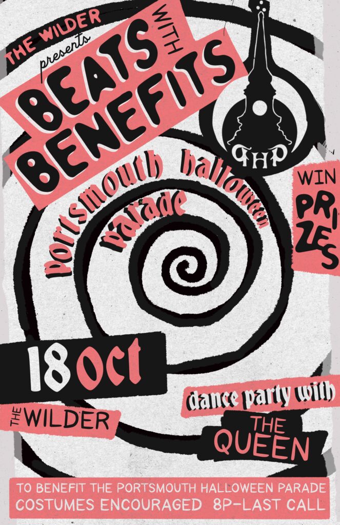
This Halloween event poster from last October is a great example of how we balanced what was on the rise for trends and maintaining our specific style. See our use of 3D bubble letters, illustration and doodles, and the texture we added to the background and text box highlights.
We’ve also noticed more of a retro vibe making a comeback in graphic design and digital art. We love this old school ‘70s feel and if we had to guess, we’d say there’s more on the way for the rest of 2024.
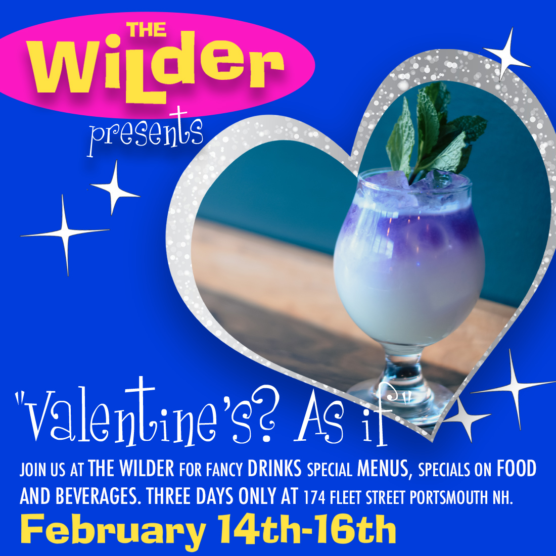
Use of bold, highly contrasting colors is another element we have on our radar as graphic design trends 2024 that we’ll be seeing more and more of. We dipped our toe into this trend with a Clueless themed Valentine’s Day event poster for The Wilder and we love how the hot pink and bright blue pop against each other.
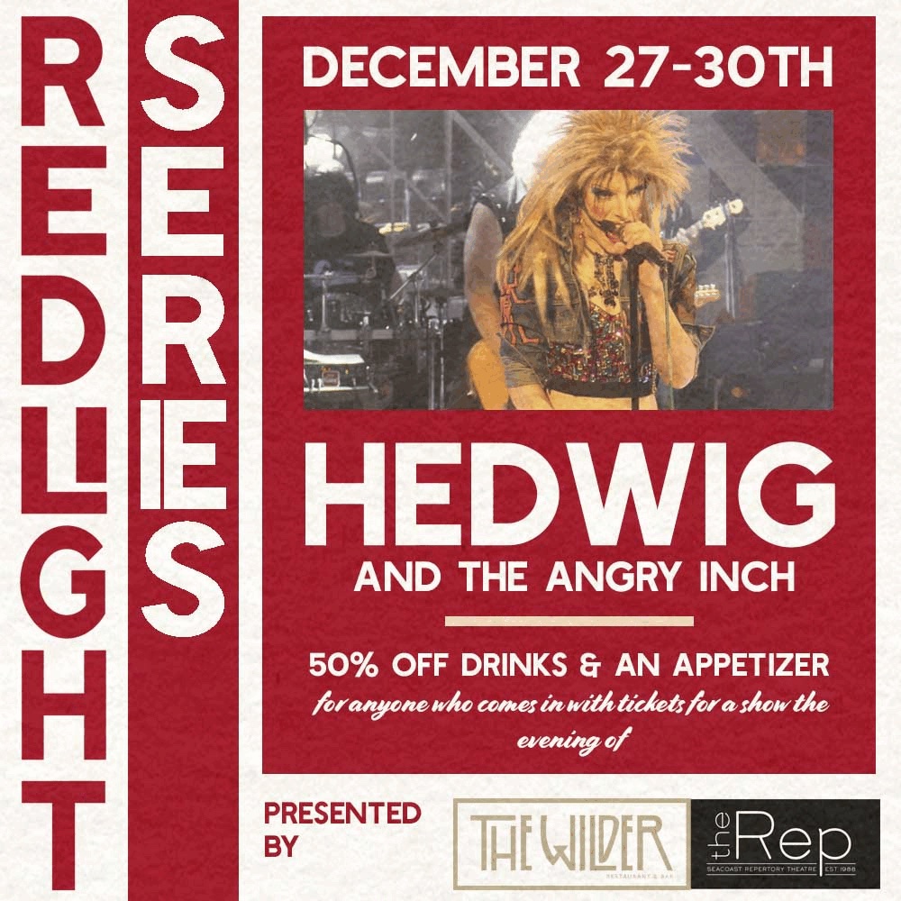
Going along with the use of bold colors, we think a sort of bold minimalism might also be on the rise. We used this sort of style in a poster for The Wilder’s Redlight Series event back in December of 2023. The minimal color palette and strong focus on font conveys the message clearly and with precision that stands out in a crowd of designs.
The important thing is that we stayed true to our own style even while picking out on and following some of these trends we’ve been noticing. We have a great time experimenting with new techniques and tools to make awesome designs and integrate different trends.
In this digital age, there’s so much exposure to graphic design. Combining your distinct design style with the hot trends of the time can lead to funky, cool designs you would’ve never thought you’d make. As artists, we always want to keep growing and experimenting; integrating some trendy elements into our designs is a great, fun way to keep pushing ourselves.

