
Why Menu Design is *Key* To Your Restaurant
When organizing a restaurant menu, there’s a lot more to the design process than just slapping a randomly ordered list of your food offerings onto a piece of paper. Having good menu organization and design can actually increase profits and add to the consumer’s overall restaurant experience. Plus, as an added benefit, restaurants that utilize menu hierarchy best practices have to deal with far less frustrated customers who can’t find what they’re looking for on the menu.
Good use of menu hierarchy means that the menu follows the natural mental model of the user while also guiding them visually from section to section. Thinking about the customer and how they will look at the menu upon receiving it is a huge part of the early design process. After all, the menu is literally for the customers. Menus should be set up in a way that makes sense for the establishment and is intuitive for the customers.
You never want your customers to be unable to find what they’re looking for in your menu and then end up not ordering something they would’ve gotten if they only knew where to find the item. This makes the visual layout of your offerings of utmost importance, especially considering menus are the main — if not only — form of media your customers interact with at your restaurant. Through the use of borders, colors, fonts, and spacing you design your menu in a way that guides your customer through your menu easily and clearly.
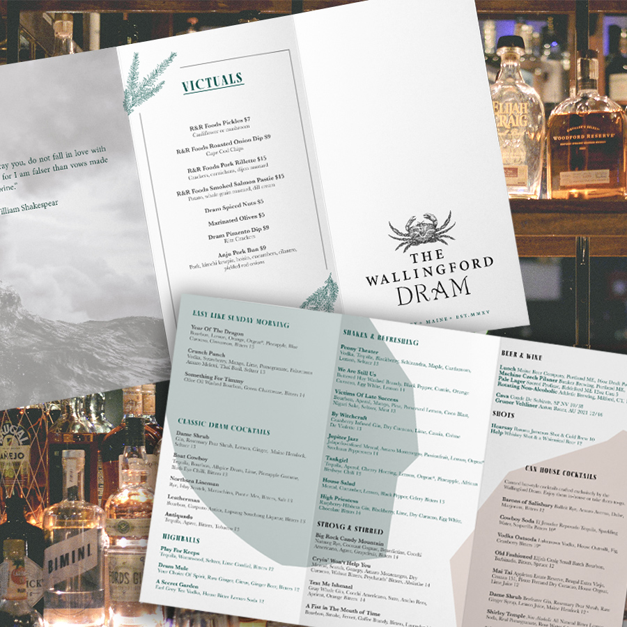
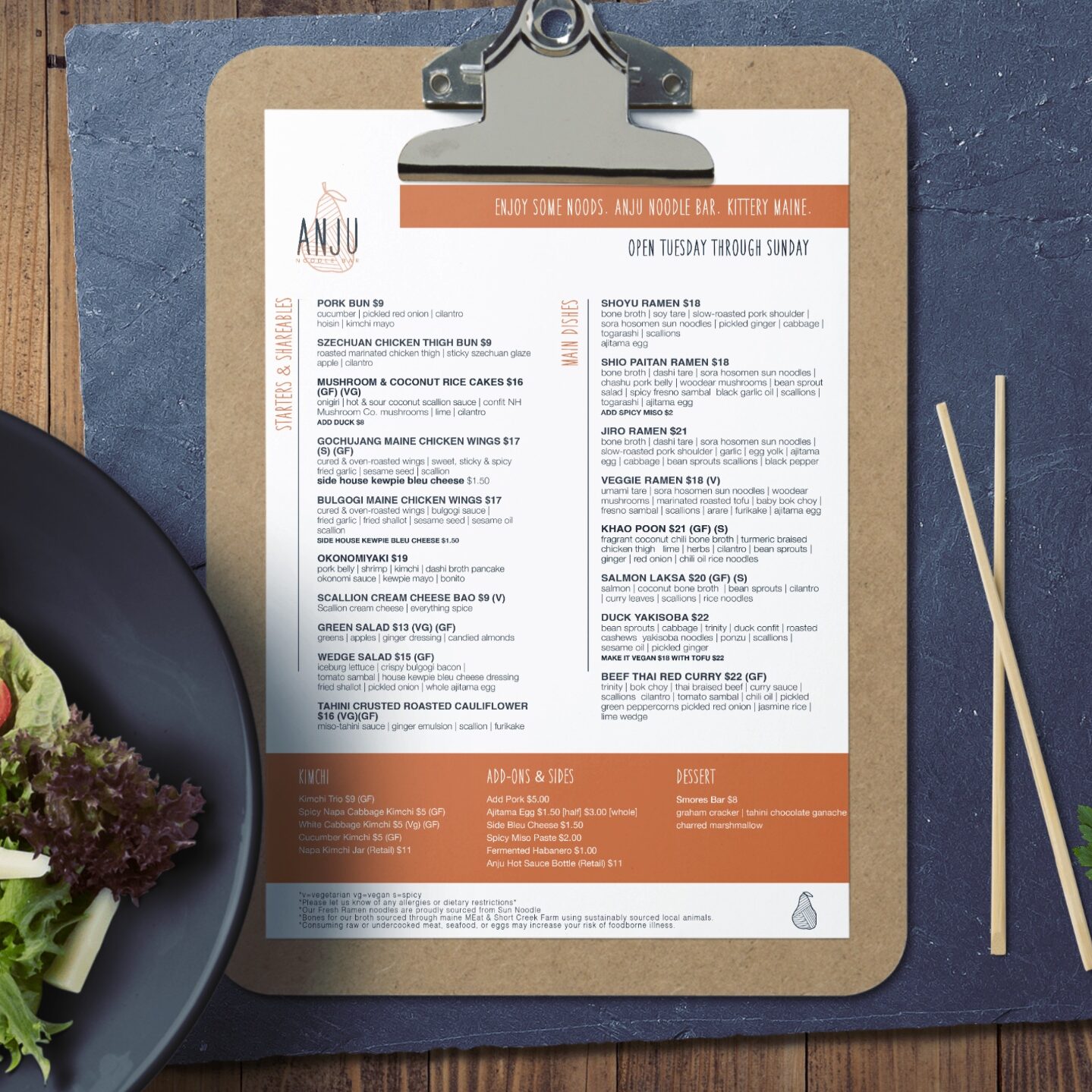
We recently redesigned menus for Anju Noodle Bar and The Wallingford Dram to help with clarity and focus more on usability for customers. Anju’s menu was more of a classic case; the menu needed some rearranging to make it easier and more intuitive to read by section and meal course. We utilized spacing and color pops to create these natural separations and call out specific menu items by drawing the eye toward them. These visual distinctions help make the menu easier to read so that customers don’t have to think too hard to find the perfect meal order!
The Dram’s menu needed some extra love to make it as cohesive and user-friendly as possible. Before, The Dram had three separate menus, each with a separate focus. Although they were pretty attached to their existing menu design, the customer was receiving so many different pieces of paper, leading them to feel overwhelmed and causing unnecessary confusion. We took these three menus and combined them onto a single piece of paper with visual distinctions to keep the different sections separated. We changed the font and hierarchy of the menu to make it easier to read, while also keeping all the offerings in one place to increase the customer’s likelihood of purchasing take-home canned cocktails which were often overlooked, and reduce paper waste as an added bonus!
Menus are one of the first things your guest is offered. Making your menu look its best can create positive first impressions that add to the overall experience of your restaurant. Menus can be just as important as the physical atmosphere in setting the tone of your customers’ meals and making them want to keep coming back time and time again. If a customer is frustrated by your menu layout, they likely won’t want to return any time soon — regardless of how tasty their meal may have been.
As the old adage goes, the customer is always right. Sometimes as a business owner, you have to focus less on your own personal preferences and more on making your customers’ experiences as enjoyable as possible. Even though you might think your menu is perfect, if your customers indicate to the contrary, it’s wise to listen. Redesigning your menu to focus on hierarchy and readability might cause a bigger increase in sales than you would’ve ever expected.


