
Exploring minimalist graphic design
We’ve all seen the rise in minimalism in recent years: a capsule wardrobe, a tiny home, discarding all clutter. These ideas are certainly gaining traction in terms of consumerism and trying to keep tabs on material possessions, but have you thought about minimalism in terms of visual design?
Graphic design has also seen a trend towards minimalism recently. In design, this looks like an elimination of any unnecessary or distracting elements that aren’t essential. It’s based on the age-old idea that less is more. A clear and simple design can be more impactful for audiences than a cluttered, super complex one.
You might think that without a ton of eye-catching elements like bright colors and wacky fonts that make your design stand out, it will be overlooked and neglected. However, getting rid of any unnecessary design elements can actually enhance the message you’re trying to convey. Avoidance of extra details makes your design communicate an idea or message more effectively than one with more distracting elements pulling the viewer’s attention away.
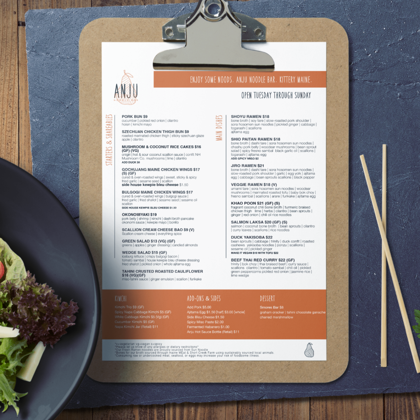
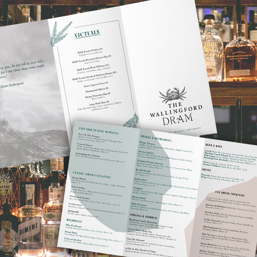
Minimalism also improves the readability of your design by utilizing font, color, and white space to prioritize hierarchy. Effective design hierarchy is super important in making sure your viewers can read and understand the text they’re looking at. Minimalism is an incredibly effective style in menu design because it cuts down on hard-to-read fonts and extra nonsense, making it easier to focus on what should be the most apparent items within a menu.
We recently designed three new menus with a focus on minimalism to improve hierarchy. The Dram and Anju Noodle Bar both needed menu updates to improve readability and decrease excess clutter. Stella’s was a brand new cafe in need of a perfect first menu. We immediately knew a minimalistic design was the way to go.
Through the use of minimalism, we were able to improve the menus of these two restaurants and create an adorable new menu for Stella’s while maintaining a sense of quality, sophistication, and professionalism.
To apply minimalism to your designs, you have to make sure you know what message you’re trying to send to your audience. Only after you have a clear understanding of your design’s goal can you figure out what’s essential to convey that message and what is just background noise.
After you know what you want your design to say and why, you can start to think about the text, colors, and intentional white space you want to incorporate. Typography sets the whole tone of the message while also being the main element that delivers the content.
As we talked about in our article “The Impact of Color Psychology in Advertising,” colors have a strong impact on the feelings your audience experiences from your design. Colors can be used to create contrast or harmony in your minimalistic design, but you shouldn’t use so many that your audience feels overwhelmed.
White space can be used to bring clarity and balance to your design so it doesn’t feel stifled or crowded. Like with the menus, white space can help guide the reader’s eye through the design while giving other elements space on the page to stand out.
Minimalism doesn’t work for every design, but it works really well for certain types. If the main purpose of your design is to convey a message or deliver information, minimalism is probably your best bet for accomplishing that goal.