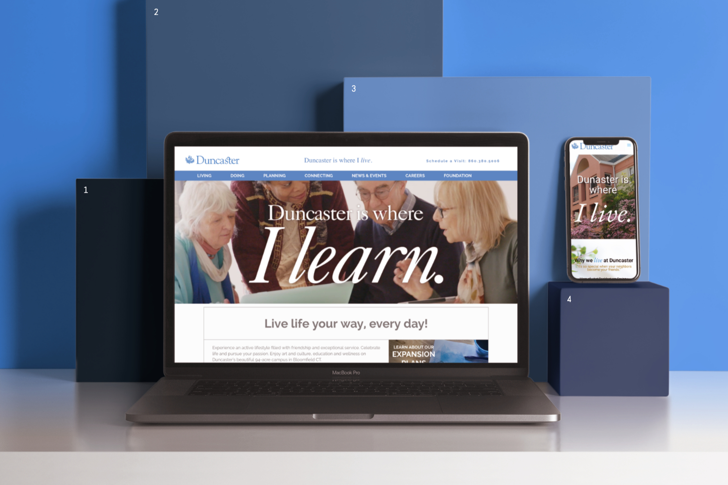
Website Usability for Retirement Communities
reCreative has worked on many websites for senior living facilities to help these companies increase their usability and online presence. Sometimes it can be easy to forget that websites are for people who are searching rather than for the company. We get it, it’s hard to differentiate things that are important to you personally from things that are important to users sometimes. Websites are tools that can help bring awareness of your business to those searching for your services, so they should always be designed and created with the user in mind. Things that may seem obvious to someone at the company may be completely unknown to someone from the outside looking in.
Often, senior living facilities are convinced that their website is organized in a way that makes sense and is intuitive. However, often this was not the case from an outside perspective. Although the existing navigation may make sense to people who are already familiar with senior living and care, these websites exist to market and provide information to people who are new to this whole thing. Generally, it’s not even the individual seeking care who is researching these facilities, but the adult child of that individual who might have very limited knowledge on the type of care their parent needs (of which there are many options).
The goal of websites for senior living facilities is to make the research process as easy as possible by giving the user the information they’re looking for in the clearest way possible. One of the most important factors in making this experience a positive one is ensuring that the site navigation is clear and intuitive for the user. This means you have to take a step back in the design process and think about how someone who doesn’t know much about the company or services would want to have information displayed to them. For example, an adult child seeking care for their parent may not know the difference between the types of care (like assisted living and skilled nursing) nor which type of care would be best for their situation. Therefore, if living options and skilled nursing are presented as two separate categories, a user may be confused by this navigation setup. We want to reduce confusion and stress as much as possible in this already difficult and emotional process.
While aesthetics aren’t everything in senior living web design, they do play an important role. Senior living facilities offer services that are targeted towards the older population, meaning it’s vital to design the website in a way that ensures its readability and considers various disabilities. The font should always be basic and easy to read while being large enough to see with impaired vision or at least have the option to easily enlarge it. Colors should be selected carefully and with colorblindness in mind. Color contrast should be utilized so everyone can see all the text. This will help not just the older folks, but anyone who visits your site looking for information. Additionally, images and videos showing off the facility and its amenities should be prominently featured. The services center around the physical setting, after all. It’s important to show off the features that could make this the perfect place for Mom or Dad.
Another important aspect is making sure the calls to action are clear and precise. We want it to be easy for users to contact these facilities and schedule visits or informational meetings. Some sites hide their CTAs which can make it difficult for users to find the next steps they should take in this process. The clearer the better. The process of finding the right facility for your parent can be hard enough without the added hassle of dealing with websites that are difficult to navigate and contain confusing content that sidetracks you from finding the information you need to know. Clarity and ease of use are the most important aspects of usability in senior living facility websites (and really, any website). Ideally, your website will make users see your facility as a place where their loved one will be happy and well cared for.


